Michael B's arcade button layout
![]()
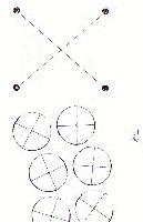
There was a message thread on the message board about the ideal spacing/layout for buttons on your arcade panels. Michael B. has a curved button layout that has proven popular with his friends. He was good enough to send me a to-scale scan of his layout for people who want to duplicate it.
![]()
Some notes from Michael first
I was in a hurry when drawing the buttons.
The cross-hairs are off center, and really only confuse you. The
dot is the actual center, where you should press the drill. You may
want to go in with a graphics editor and remove the cross-hairs to avoid
confusion. (saint's note - I did not modify the
image, you'll have to do that yourself if you wish) (This
was really a preliminary template, I was going to do the finals in AutoCad,
but realized it wasn't really necessary).
The circles are the actual size of
an arcade button, not the 1 1/8" hole they are mounted in.
The joystick crosshairs are for the
Happ Super Joystick. If you're using a different joystick, check
and see if the holes still line up. The center hole should be good
for all joysticks. :) BTW: I used the same 1 1/8" drill bit
for the joystick center as I did the button holes.
Test this out on a scrap piece of
particle first!! Don't try it on your final control panel, dislike
it, and blame me for ruining everything! :)
